 I have been working on moving the graph generation from a spreadsheet on my laptop to something more automated, and also integrating the date information kindly provided by Jennifer and Carl into them. Now I have something I think will be the beginning of a more flexible graphing page where you will be able to select which plans and which date ranges or phase ranges you wish to graph. For the moment I have set it to only generate three graphs, one for each collection, but watch for the form based system with options for other graphs soon. You can see the graphs at a new URL: https://bluedonkey.org/bayport/, although I will probably continue to link to the graphs from here as well.
For those interested in what is going on behind the scenes here, I have entered all the data into a database on the webserver, and using a PHP script I can extract subsets of the data from the database and the plot these graphs using a package called JpGraph. JpGraph seems to be very powerful. I don’t think I am really scratching the surface of what it can do so far – expect more graphs to follow.
Also, if anybody has min & max prices for each plan in each release, I have slots for that in the database too. I might then see about plotting a vertical on each release point that covers the range of prices for that plan on that day.

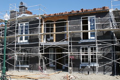 Saturday morning I took the camera and my bike and cycled over to the site of our new house to get some exterior photos (I already have interior ones from the pre dry wall inspection we were invited to join last week). So, here is the front of the house so far.


